Warranty Benchmarks:
Graphs of all manufacturers' claims and accrual rates don't follow bell curves. They're Pareto distributions, where lots of companies spend small amounts on warranty and a few heavyweights spend a lot.
In warranty, it turns out, there are a whole lot of manufacturers with relatively low expenses, and a handful of heavyweights with relatively high rates of warranty spending. In chart form, the data to support that statement lines up so neatly it looks fake.
Last week, in an article about APQC's Service After Sales Survey, there was a bit of discussion about one of the questions that asked about warranty claims rates. Based on the respondents' own self-reported claims rates, APQC had divided the world into four quarters. The "top performing" quarter were those with claims rates at or below 0.1%. The "bottom performing" quarter were those with claims rates at or above 2.7%. The median was 1.2%.
However, there were only 14 responses to this particular survey question. So we quickly compared these data points to those gathered last year during our quarterly census of all American manufacturers. And we found our 25% mark at 0.4%, our 50% mark at 0.8% and our 75% mark at 1.5%.
No Bell Curve?
We wanted to graph this data in a nice little bell curve, with the median at the top and the 25th and 75th percentiles to either side of the peak. But there were two problems. First, unlike the median, which of course is always in the middle, the weighted average we'd computed was more like 1.7%, which was actually a little above the 75th percentile. That meant the average company in our book was a bottom performer in theirs.
Secondly, the chart wasn't shaped like a bell curve at all. It was shaped more like what statisticians call a Pareto distribution -- a boomerang-like figure that first hugs the vertical axis and then hugs the horizontal axis, making a parabolic turn somewhere in the middle. This was no bell curve. Maybe it was half a bell? Or maybe it was a mistake? Either way, it wasn't ready for publication, so we put it off for a week.
That week turned into eight days, as we charted not only warranty claims rates in 2006, but also accrual rates, and also repeated the process for both rates for the years 2003, 2004, and 2005. And they all ended up looking like Pareto distributions. So let's show you what we mean.
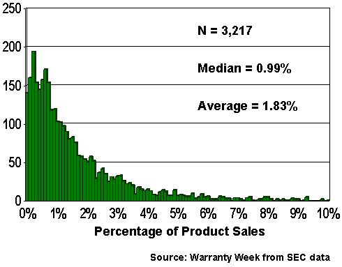
Figure 1 and 2 are compilations of four quarterly warranty spending reports gathered from some 820 American manufacturers in 2003. Over the course of the four reports, there were 3,245 measurements made of claims rates, and 3,217 measurements of accrual rates. In each case, claims and accruals were measured in US dollars and were then divided by each company's product sales revenue, again in US dollars, resulting in a pair of percentage figures for each company in each quarter.
Methodology
To create these charts, all those percentages were listed from smallest to largest, and were then assigned a spot within one of 101 intervals between 0% and 10%. Well, strictly speaking, there was 0% and then there were 100 intervals -- each 0.1% wide -- between 0% and 10%. The graphs below are numeric counts of the frequency of reports falling within each of these intervals.
Figure 1
Warranty Claims Rates in 2003:
All US-Based Manufacturers
(claims as a percent of sales)
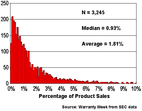
As can be seen in Figure 1, the peak comes early, specifically for the interval between 0% and 0.1%. There were 208 reports of claims rates between those figures, out of a total of 3,245 reports. Then there were 195 claims rates between 0.1% and 0.2%, and 190 between 0.2% and 0.3%, and so on. We arbitrarily cut off the tail at 10% to make the remaining data more readable.
In Figure 2, the peak is between 0.1% and 0.2%, which is the interval into which 194 accrual rate reports fit. There were only 140 reports of a 0% accrual rate, and 160 reports of rates between 0% and 0.1%. As in Figure 1, each subsequent interval contains fewer reports than the one before it, more or less, with a few aberrations, bumps and detours along the way.
Figure 2
Warranty Accrual Rates in 2003:
All US-Based Manufacturers
(accruals as a percent of sales)
Because of those rough edges along the parabola, where the totals for some intervals exceed those that precede them, we can't quite call it a Pareto chart, where all the columns are ranked in strict order of descending size. But we can say it approximates a Pareto distribution. Named after the Italian mathematician Vilfredo Pareto, whose discovery that 80% of the wealth was held by 20% of the people led to the so-called 80-20 rule, a Pareto distribution is the shape of graphs of everything from the file size of emails to the magnitude of casualty insurance losses. Basically, there's lots of little ones and a few big ones.
The first interval with absolutely no data within it borders comes between 8.6% and 8.7% in Figure 1 and between 6.7% and 6.8% in Figure 2. But it's not so noticeable because by that point the tail is barely visible. However, as you'll see later on in Figure 9, there is data all the way out past 10%. There's just not a lot of it.
The Warranty Pareto
Who knew that the warranty claims and accrual rates reported by so many separate and independent American manufacturers would follow a Pareto distribution? But it does make some sense if you think about it. Imagine a warranty as a sort of product liability insurance policy, and each of the 800 manufacturers as a policyholder. Many report little or no product liability, but a relative handful report heavy liabilities. So why shouldn't the graph look similar to what an insurance company would see when looking at the loss cost of 800 automobile liability policies?
In each of the following pairs of figures, we've repeated the same procedures for the years 2004, 2005, and 2006. This drives home the point that while the eight charts are each a little different, they're actually all quite similar. In other words, there's a pattern here that remains in force from one year to the next.
There are some important differences, however. Note that each chart contains three figures in the upper right corner. The first is N, the number of observations of each metric made within the year in question. The second is the median -- the claims rate or accrual rate in the exact middle of each group.
And then there's the average, or more specifically, the weighted average. For each individual company, the claims rate or accrual rate is computed by dividing the claim or accrual total by the product sales total. For the weighted average, however, all of the claims or accrual totals for all 800 companies are added, and are then divided by the combined total product sales of all 800 companies.
In these particular charts, the median is always lower than the average. This is because well-known manufacturers and heavyweight warranty providers such as GM, Ford, HP, IBM, Whirlpool, Motorola and Caterpillar are all spending upwards of 2% of their product revenue on warranty claims. GM, in fact, would be at the 87th percentile in Figure 3, meaning that only 13% of all the claims rates measured in 2004 exceeded its 2.85% rate.
Figure 3
Warranty Claims Rates in 2004:
All US-Based Manufacturers
(claims as a percent of sales)
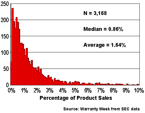
Of course, GM is also by far the largest warranty provider based in the United States, so its weight and the combined weight of the others moved the average out to 1.64% in 2004. As a few of these heavyweights continue to cut their warranty costs, it moves the average even further in towards the median. But there will always be that gap, because consumer-facing OEMs with well-known brand names seem to attract warranty claims like honey attracts bears.
Note that since 2003, the median has remained in a range of 0.8% to 1.0% while the weighted average has gradually fallen from around 1.8% to as low as 1.6%. Note also that the size of N has fallen from year to year as manufacturers are acquired or go out of business. While there are also occasional new entrants that have gone public over the last few years, for the most part the trend is in the opposite direction, where private equity firms and Chinese importers have reduced the number of companies that report their warranty figures to the U.S. Securities and Exchange Commission.
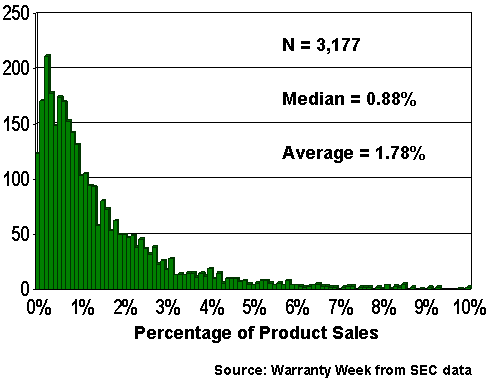
Figure 4
Warranty Accrual Rates in 2004:
All US-Based Manufacturers
(accruals as a percent of sales)
By 2005, the number of quarterly warranty reporters had fallen under 750 companies, though the total claims and accruals they reported continued to grow. So while the peaks weren't as high on the left side and the tails weren't as thick on the right side, the charts still kept the same basic shape.
Notice how the number of reports tapers off dramatically after the 4% or 5% level is reached. In all cases, we've cut the tails off at 10%, but there were companies which exceeded even that level. In fact, in 2005 there was a company that reported an accrual rate of more than 600%, based on an accrual of $40,000 made on only $6,000 in product sales (it was a medical company that earned the bulk of its revenue from stem cell research services).
Figure 5
Warranty Claims Rates in 2005:
All US-Based Manufacturers
(claims as a percent of sales)
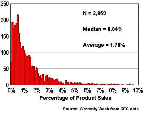
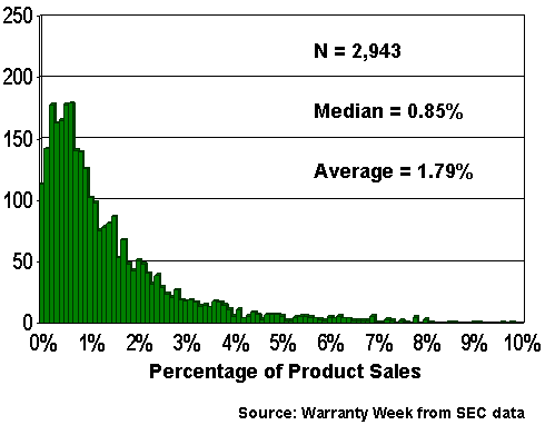
Figure 6 is unusual in that there are seemingly three peak intervals with the same number of reports in each. Rest assured, the Mount Everest of the bunch is the interval of 0.5% to 0.6% with 179 accrual rates within its borders. The other two nearby peaks contain a mere 178 reports in each. So like K2, they don't get a proper name.
Figure 6
Warranty Accrual Rates in 2005:
All US-Based Manufacturers
(accruals as a percent of sales)
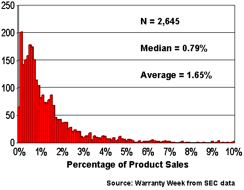
In 2006, the number of warranty-reporting companies continued to drop, and the median and weighted averages of their reports also continued to fall. However, note that in both Figures 7 and 8, the most populated interval is also the first after zero: 0% to 0.1%. What this means is that as in all well-behaved Pareto distributions, the smallest amounts are the most numerous.
Figure 7
Warranty Claims Rates in 2006:
All US-Based Manufacturers
(claims as a percent of sales)
In addition to the medians, the metrics cited by APQC to separate the bottom performers from the rest of the pack also continued to fall from one year to the next. In 2003, the 75th percentile was 2.1%. In 2004 it was 1.9%. By 2005 it was 1.8% and in 2006 it fell to 1.7%.
The 25th percentile, however, has more or less remained where it was at 0.4%. If we were to expand the percentages from tenths to hundredths we might see some downward movement, but they'd all still be within the same interval on each chart.
And don't forget, some of the heavyweights have shed a lot of warranty weight. Between 2003 and 2006, HP cut its claims rate from 4.0% to 3.2%. GM fell from 2.8% to 2.6%. Caterpillar went from 2.3% to 1.9%, and United Technologies fell from 1.8% to 1.1%. Thanks to these shifts, the weighted averages fell.
Figure 8
Warranty Accrual Rates in 2006:
All US-Based Manufacturers
(accruals as a percent of sales)

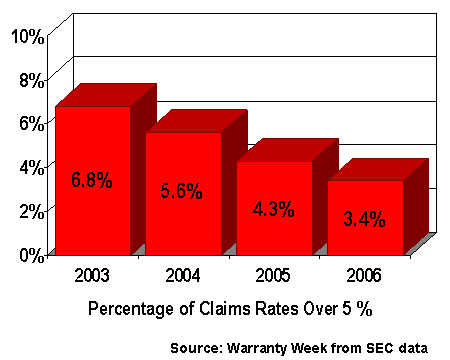
The most surprising aspect of the Pareto distributions for warranty claims and accrual rates is how the "tail" of the curves continues to shrink over time. Each year, there are fewer and fewer companies reporting either claims or accrual rates over 5%, which most consider to be the "red line" that signals a manufacturing problem.
The Shortening Tail
In Figure 9, we've counted all of the companies with claims rates over 5%, and divided the result by the total number of companies. For instance, in 2003 there were 222 reports of claims rates at or above 5%, out of a total of 3,245 reports. That's equal to 6.8%.
By 2006, the total number of reports had fallen to 2,645, but the number of reports of claims rates over 5% had fallen even faster, to only 90 during the entire year. That's equal to 3.4% of the reports, which means the tail had shrunk to half its size in only three years.
Figure 9
Shortening the Length of the Tail:
Warranty Claims Rates Over 5%
2003 to 2006
(claims as a percent of sales)
This suggests two explanations. First, if there has been some attrition among American manufacturers, it has happened more often among those with high claims rates and low quality levels. Second, manufacturers with relatively high claims rates have become more aware of how far out on the tail they are, and have taken steps to cut their warranty expenses.
The same effect can be seen with warranty accruals. Of the accrual rate reports tabulated in Figures 2, 4, 6, and 8, a decreasing share of reports has fallen into the tail area to the right of the 5% mark. In lieu of another graph, we'll just tell you the data points. In 2003, 191 out of 3,217 accrual rate reports were above 5%, placing 5.9% of them into the tail area. That rate fell to 5.1% in 2004, 4.2% in 2005, and 3.3% in 2006.
Last year there were only 88 occasions when a company overtly put aside 5% or more of its product sales revenue to finance warranty repairs. There were 2,580 occasions when they put aside less than 5%. In fact, there were 99 occasions when they chose to put absolutely nothing aside, either because they expected no claims or because they wanted to burn off some of their warranty reserves.
Increased Scrutiny
So perhaps what's really going on here isn't so much due to the work of Vilfredo Pareto as it is related to the so-called "observer effect," which is sometimes mixed up with the Heisenberg Uncertainty Principle. Briefly stated, this physics theory holds that in certain instances, the very act of observing something changes the nature of the observation. In warranty accounting, until 2003 very few people knew how much a given company was setting aside to pay warranty claims, and nobody knew how much all manufacturers set aside. Now, any shareholder with a calculator can figure it out. Therefore, it's become more difficult to put excessive amounts aside year after year without offering either an explanation or a letter of resignation.
The roster of Warranty Week readers includes numerous financial experts, actuarial types, and statisticians of one sort or another. Any readers who would like to take a closer look at the raw data, or who have any explanations or comments that might shed more light on the meaning of the data, please contact the editor at earnum-at-warrantyweek.com with your theories and suggestions.