
Warranty Benchmarks, Part Two:
Big companies really do pay more. The larger the manufacturer, the more warranty claims they pay. And in both the automotive and computer industries, OEMs tend to pay more claims than their parts suppliers.
Although it's not quite as simple as the 80-20 rule, in warranty there seems to be a handful of well-known and consumer-facing companies that pay the most claims, and behind them a much larger group of suppliers who pay relatively low claims rates.
Reactions to last week's Pareto distribution charts of warranty claims and accruals by year were mostly positive and somewhat tentative. Chopping up the data by year, some felt, simply showed that manufacturers are consistent over time. But what if the data was sliced a different way?
One reader suggested that the reason for the shortening of the tail over time was related to the shrinking duration of some warranties. Companies that find their claims or accrual rates are consistently high could try to lower them by shortening their warranties. Product quality may be just as bad as before, but after 90 days it becomes someone else's headache (perhaps the extended warranty administrator's?).
Another reader said small companies simply can't afford the big payouts, and would do anything they could to keep their warranty expenses low. The converse of this statement suggests that big companies can afford the big payouts, which we suspect to be the case but don't know how to prove.
Instead, what we can do is use a Pareto distribution to illustrate how big companies tend to have higher warranty claims rates than either small or medium-sized companies. So what we did was to split up the available universe of some 900 manufacturers into three arbitrary groups: small, medium, and large companies. We split it so the "large" group would contain exactly 100 manufacturers that are each paying out an average of $30 million or more in claims per year and the "small" group would contain 500 manufacturers paying out $2.5 million or less per year. The "medium" group would contain the remaining 300 manufacturers in between.
Methodology
The warranty claims rates computed for these 900 manufacturers over the the 18 quarters between the beginning of 2003 and the middle of 2007 were sorted into one of 101 intervals between 0% and 10%. Each interval was 0.1% wide, except the first (which was for 0% measurements only). The tail was cut at 10% to keep the size of the charts manageable.
In all, there were some 13,209 observations of claims rates, computed by dividing claims paid by product revenue. Only 135 were above 10%. Only 335 were equal to 0%. Half were above 0.86% and half were below that figure.
The peak interval in Figure 1 is also one of the smallest. Some 927 calculations of claims rates between 0% and 0.1% were counted in the sampling, consisting of 789 from small companies, 129 from medium-sized companies, and only nine from large companies.
Figure 1
Warranty Claims Rates by Company Size:
All US-Based Manufacturers, 2003-2007
(claims as a percent of sales)

The overall shape follows the classic Pareto distribution pattern, but only because the reports from the small companies are so numerous. Neither the large nor the medium-sized companies follow the classic Pareto pattern, where the most numerous interval comes early and the count decreases in a parabolic shape. Instead, they look somewhat bell0-shaped. All three have long tails, but the large company group peaks in the interval between 1.5% and 1.6%, while the medium-sized group peaks between 0.4% and 0.5%.
Supporting Data Available
We'll spare you the supporting charts for these, and instead invite interested readers to contact the editor at earnum@warrantyweek.com to obtain copies of the data. But we'll list here some of the summary data points that will make plain how the center of gravity shifts to the left with the descending size of the companies involved.
In Figure 1, the "N =" notation refers to the number of data points. Under it is a figure for the median, which in this case is 0.86%. This means that half of all the warranty claims rates measured quarterly since 2003 have been above 0.86%, and half have been below that percentage. One could also say that 0.86% is at the 50th percentile, meaning that this figure is exactly in the middle of the data set.
The Italian mathematician Vilfredo Pareto is known for his discovery a century ago that 80% of the wealth was held by 20% of the people, and its corollary that only 20% of the wealth was held by the remaining 80% of the people. This led to the so-called 80-20 rule, and a graph with a shape that's called a Pareto distribution.
The median, as mentioned, is at the 50th percentile, precisely in the middle. In Pareto's honor, we'll also highlight the claims rates that are at the 20th and 80th percentiles for each of these groups. What these mean is that a company at the 20th percentile has a lower claims rate than 80% of all other manufacturers. A company at the 80th percentile has a lower claims rate than only 20% of all other manufacturers. Or, to look at it another way, a company at the 80th percentile has a higher rate than 80% of all other manufacturers.
In Table 1 below, we've detailed the claims rates for each group at the 20th, 50th, and 80th percentiles. Notice how the figures get lower for each group.
Table 1
Warranty Claims Rates by Company Size:
All US-Based Manufacturers, 2003-2007
(claims as a percent of sales)
| Percentile | ||||
| Segment | N = | 20th | 50th | 80th |
| Large Co. (red) | 1,741 | 0.88% | 1.73% | 3.15% |
| Medium Co. (green) | 4,899 | 0.44% | 1.02% | 2.33% |
| Small Co. (orange) | 6,569 | 0.14% | 0.54% | 1.54% |
| All Companies | 13,209 | 0.28% | 0.86% | 2.17% |
Within the group of the 100 large companies, only 20% of the claims rates are below 0.88%. And, in fact, none of these 100 companies have ever reported a 0% claims rate (although some have occasionally made no report at all). In contrast, 20% of the small companies were below 0.14%. Indeed, an astonishing 64% of the small company claims reports were below 0.88%, meaning that what's at the 20th percentile for large companies would be the 64th percentile for small companies (it would be the 44th percentile for medium-sized companies).
At the opposite extreme, what is listed as the 80th percentile for large companies would be the 92nd percentile for small companies, and the 87th percentile for medium-sized companies. This means that while 20% of all claims rates computed for large companies have been above 3.15%, only 8% of all small company reports have been above that level.
They really are different. Smaller companies spend a smaller percentage of their revenue on warranty. It's not just that their data is more numerous. There's also a pronounced shift to the left.
In Figure 1, of course there is more data from the small and medium-sized companies, so they dominate the chart. But look how the center of gravity for the large companies (in red) seems to be somewhere out between 1% and 2%. The center of gravity for the medium-sized companies (in green) is below 1%, but it's not as close to the vertical axis as is the data for small companies (in orange). Table 1 proves this to be the case.
Pareto for Specific Industries?
Another reader asked if the claims data follows a Pareto distribution within specific industries. The answer seems to be a qualified yes, as long as the sample size is large enough and as long as both large and small, and OEM and supplier, are counted together. You really need 80 to 100 companies and upwards of 1,500 data points for the Pareto curve to take shape.
To illustrate this answer, we took all 2003 to 2007 claims data from the automotive and high-tech industries and sliced it up using the same procedures as are outlined above. We gathered 2,039 claims rates from 137 automotive companies and 5,116 claims rates from 350 computer/telecom manufacturers, and sliced them into 101 intervals between 0% and 10%.
The automotive sector has historically accounted for about 45% of all warranty claims dollars, while the high-tech segment accounts for another 33% of the $28 billion paid out each year by U.S.-based manufacturers. So while it's only two industries, it's almost 80% of all warranty activity.
The problem with small sample size really becomes an issue when one looks at just the OEMs of either industry. Companies such as Ford, GM, HP, and Dell may be few in number, but they account for the bulk of the warranty expenses in their respective industries. And not only do these OEMs pay out the most; they also pay out the highest percentage of their product revenue.
Let's take a look at the automotive industry first. In this instance, we've divided the available population into 42 OEMs and 95 parts suppliers. At best, Figure 2 looks like a sloppy Pareto distribution. Yes, it has that familiar parabolic slope, but the peak comes at the intervals between 0.3% and 0.5%. And the OEM data (in dark blue) has a rather gentle slope compared to other data sets.
It doesn't look much different when OEMs and parts suppliers are charted separately. We won't include them here, but suffice it to say that neither of the two separate charts looks as good as they do together. Readers can take our word on it, or they can request that data by sending a message to earnum@warrantyweek.com.
Figure 2
Warranty Claims Rates, 2003-2007:
All US-Based Automotive Manufacturers
(claims as a percent of sales)
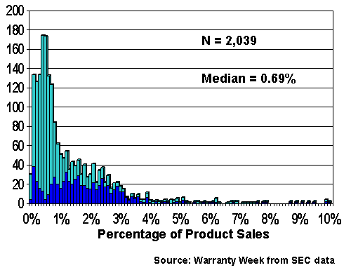
Especially curious is the relative rarity of very low claims rates in this industry. It's as if few automotive companies are allowed to get away with paying little or nothing for long, so strong is the urge to make claims. And OEMs are even more unlikely than suppliers to get away with a low claims rate -- only four out of 652 claims rates in that sector were measured at 0%, and only 65 were below 0.2%.
Table 2 shows how different the OEMs really are from their suppliers. While the 50th percentile for OEM claim rates is 1.54%, that would be the 82nd percentile for parts suppliers. While the 20th percentile for parts suppliers is 0.24%, such a claims rate would be at the 11th percentile for OEMs.
Table 2
Warranty Claims Rates, 2003-2007:
All US-Based Automotive Manufacturers
(claims as a percent of sales)
| Percentile | ||||
| Segment | N = | 20th | 50th | 80th |
| OEM (dark blue) | 652 | 0.71% | 1.54% | 2.58% |
| Parts (light blue) | 1,387 | 0.24% | 0.52% | 1.39% |
| All Auto Companies | 2,039 | 0.29% | 0.69% | 2.05% |
It's much the same story in the high-tech industry, except that there are even fewer computer OEMs and even more suppliers. So let's rephrase that: the high-tech industry provides an even better example of how different the OEMs are from their suppliers when it comes time to pay warranty claims.
In Figure 3, we've taken the 350 U.S.-based manufacturers reporting warranty claims in the computer/telecom sectors and chopped them into five segments: computer OEMs (yellow), disk drives (pink), peripherals (blue), semiconductors (orange), and telecommunications equipment (purple). It's a little hard to see the OEMs, but they're in there at the bottom of the chart, if you squint.
Figure 3
Warranty Claims Rates, 2003-2007:
All US-Based High Tech Manufacturers
(claims as a percent of sales)
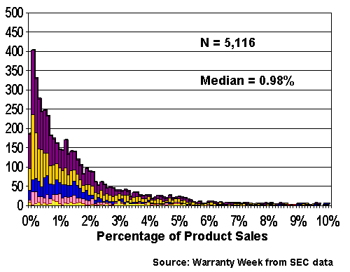
On their own, data for the telecom and semiconductor segments looks somewhat like Pareto distributions, due in part, we suspect, to the large sample size and due in part to the inclusion of both OEMs and suppliers within these segments. The disk drive and peripherals data resembles Pareto distributions, but looks a little off, while once again the OEM sector looks like anything but a Pareto distribution. Readers interested in seeing these five charts can contact the editor.
With only a few exceptions, the 20th, 50th, and 80th percentile figures for these industry segments appears to organize itself in descending order. As is the case with automotive, OEMs in this industry also have the highest rates and their suppliers have the lowest. Computer OEMs have 20th and 80th percentile figures of 0.77% and 3.98%, respectively, while telecom equipment makers are at 0.2% and 2.2%. In fact, the 20th and 80th percentile figures for the industry as a whole are at 0.24% and 2.51%, which just shows how outnumbered the OEMs really are.
Table 3
Warranty Claims Rates, 2003-2007:
All US-Based High Tech Manufacturers
(claims as a percent of sales)
| Percentile | ||||
| Segment | N = | 20th | 50th | 80th |
| OEM (yellow) | 240 | 0.77% | 2.22% | 3.98% |
| Disk Drive (pink) | 469 | 0.34% | 1.11% | 2.15% |
| Peripherals (blue) | 823 | 0.42% | 1.07% | 1.92% |
| Semiconductor (orange) | 1,600 | 0.18% | 0.94% | 3.05% |
| Telecom Equip. (purple) | 1,984 | 0.20% | 0.83% | 2.19% |
| All High Tech | 5,116 | 0.24% | 0.98% | 2.51% |
Notice that the data organizes itself in descending order with only a few exceptions. The first exception can be found in the semiconductor sector, where its 80th percentile figure of 1.92% is higher than most of the others. We think this has something to do with the split personality of this sector, where the equipment used to fabricate the circuits attracts rather high levels of warranty spending, while the devices themselves attract much lower claims rates. Notice that semiconductors also have the lowest of the five figures for the 20th percentile, which is due in no small part to the numerous device makers reporting 0% or 0.1% claims rates.
Second, the peripherals data is more crowded into the middle than is the case with the other sectors. By this, we mean that its 80th percentile figure is the lowest, and its 20th percentile figure the second highest, of the five sectors listed here. This means the data is more concentrated in the middle, closer to the median. This is somewhat puzzling and unexpected, given that the sector is dominated by both highly-reliable monitors and high-claims-rate-producing printers.
Once again, however, if there is enough data the chart looks like a Pareto distribution. You ad together the five sectors and the curve of the data looks like it should. That seems to be the lesson here. While the claims and accrual data for a whole industry or a whole year does what it's supposed to, the data for a small segment doesn't behave as it should. And especially when that small segment is comprised of large, well-known, consumer-facing OEMs, it's going to come up short on the low-rate data that is needed to produce the left-hand side of a well-behaved Pareto distribution.