Eighth Annual Warranty Report,
Totals & Averages:
When sales fell, so did warranty costs. But even though sales are rising again, warranty costs are remaining low as a percent of sales. That reflects a change in reliability, and caps a multi-year success story resulting from the increased attention paid to warranties.
It's no April Fools joke: The amount of money spent on product warranties in the U.S. continues to shrink, because products are getting better.
A reader once reminded your editor that behind every warranty claim is a product failure. And after a look at the brand new data for the eight years between 2003 and 2010, it appears that products are failing less, for two reasons:
- First, there are less of them in the field under warranty. Because of the financial panic of 2008, product sales fell in 2009 and are still below peak levels in 2010. And because customers are holding onto their existing products longer, more of those units still in use are now out of warranty. Simply put, there are fewer units in the field under warranty and therefore less warranty work to be done.
- But second, there's another trend at work. Over the past eight years, many manufacturers have gotten very serious about their warranty expenses, making their processes more efficient and making their products more reliable. They're not only spending less for fewer units sold; they're also spending less per unit sold.
Since early 2003, Warranty Week has tracked the warranty claims and accrual figures published by hundreds of major U.S.-based manufacturers in the footnotes of their annual reports. With most of those annual reports for the calendar year 2010 filed with the U.S. Securities and Exchange Commission by the end of March 2011, it's now time to take our annual look at the data.
In the March 18 newsletter, we took a look at trends within just the top 100 warranty providers of 2010. In the April 8, 2010 newsletter, we looked at trends as they stood a year ago. In the May 7, 2009 issue of Warranty Week, we detailed the year-end 2008 trends two years ago. We hope you'll take a look back to see the changes over the years.
14 Industry Sectors
In Figure 1 below, we've taken all of the reporting manufacturers from all of those years and corralled them into one of 14 industry sectors, based on their leading warranty-bearing product lines. Some companies, such as Motorola Inc. and United Technologies Corp., could fit into more than one sector, but we've assigned them to just one, to keep the data consistent over time (Motorola to telecom and United Technologies to HVAC and appliance).
The most obvious trend in Figure 1 is the continuing decline in claims paid by these manufacturers. The total peaked in 2008 at $29.5 billion, and has fallen by more than $5.3 billion since then to $24.1 billion reported for 2010.
Figure 1
Worldwide Warranty Claims
of U.S.-based Companies
(claims paid in US$ millions, 2003-2010)
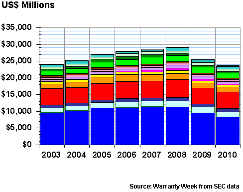
The claims total was down 12.2% last year, and fell another 6.7% this year. Claims in the automotive OEM sector fell by 12.3%, but although that was a huge $1.15 billion decline, it wasn't tops in percentage terms. The sector that includes building materials, fixtures and furniture fell by 12.4%, and surprisingly, consumer electronics fell by 47%.
Changing the Totals
We should note that this data is always changing, for instance when a company first goes public, and debuts with warranty disclosures covering two or three years at a time. Sometimes bankrupt companies are a year or two late with their annual reports because of their financial problems, and they suddenly catch up with multi-year disclosures. Other times, as with the split-ups of Motorola, Tyco International, and American Standard, completely new companies are created. And sometimes this changes the data not only for the current year, but also for a few years previously.
We must also note, however, that the data does not include the many European and Asian importers who dominate the consumer electronics industry, so what you're seeing listed here as "CE" is really just some car audio, jukebox, speaker and navigation equipment sold by U.S.-based companies. Most of it isn't even made here.
Meanwhile, Apple is still in the computer category, and both pieces of Motorola are in the telecom equipment sector, so you're not even seeing the swift uptake in smartphones being reflected in the CE sector data here. It has more to do with companies like Microsoft getting their product reliability under control and reducing their warranty woes.
At the other extreme, some sectors showed a surprising jump in claims totals. Homebuilders saw a 10% increase in claims last year, which follows a 35% decline in 2008-2009. And computer makers saw a 4.6% increase, which also follows a 2008-2009 decline. Overall, six sectors saw claims fall at above-average rates. Four fell at below-average rates. And four grew.
Surprising Rise in Accruals
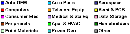
The big surprise was the increase in accruals. After declines in 2007-2008 and again in 2008-2009, manufacturers in 2010 once again began to set aside more money to fund future warranty work. Much of that reflects an uptick in sales, however, because as will be seen in Figure 4, they've never before set aside such a low percentage of sales in accruals as they did in 2010.
Figure 2
Worldwide Warranty Accruals
of U.S.-based Companies
(accruals made in US$ millions, 2003-2010)
The accrual total in 2010 was $23.4 billion, up 7.6% from $21.7 billion in 2009 but still below the 2007 peak of $30.2 billion. Sectors seeing the most growth in accruals include semiconductors, computers, and telecom equipment. But the automotive sector was also above average with a 10% increase in accruals by the OEMs and an 11% increase by their suppliers.
Seven sectors saw accruals fall, led by consumer electronics, power equipment, and building materials. All three were also among the sectors showing above-average declines in claims, so there's a trend here. And then there were three sectors that increased their accruals, but at below-average rates: aerospace, and computer peripherals.
The Warranty Reserve Balance
Accruals, you could say, are what you think will happen. Claims are what actually happens. When you sell a product, you predict the future need for warranty work and set aside that amount as an accrual. As that product ages, you draw funds from the warranty reserve to pay claims.
These inflows and outflows are reflected in the warranty reserve fund balance. Besides claims and accruals, there are also adjustments made for acquisitions and divestitures, foreign currency fluctuations, and corrections for past errors in accrual estimates. So the $1.7 billion decline in claims and the $1.7 billion increase in accruals doesn't exactly equate to an unchanged balance in the warranty reserve fund totals.
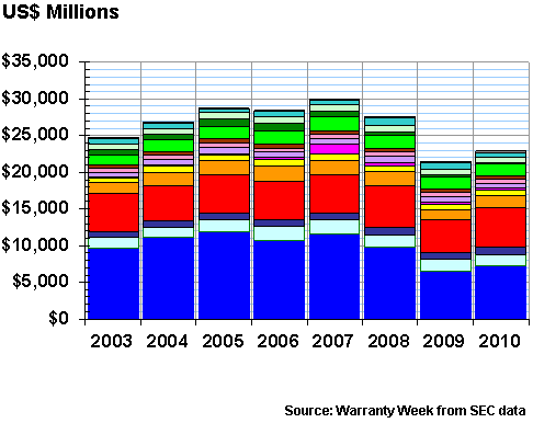
In Figure 3, one can see a $96 million increase in warranty reserves from the end of 2009 to the end of 2010. This is very close to the predicted change, which means there was only a net $96 million upwards adjustment for all these other items in 2010.
The warranty reserve funds of all reporting U.S.-based manufacturers grew by 0.3% to $35 billion at the end of 2010 -- a figure that is also well below its 2007 peak of $41.8 billion. In fact, it's the second-lowest warranty reserve total ever recorded since warranty reporting began in 2003, beaten only by the year-end 2009 total.
Figure 3
Worldwide Warranty Reserves
of U.S.-based Companies
(year-end balance in US$ millions, 2003-2010)
The 14 sectors were once again split, with seven declining in balance, and seven showing a net increase in warranty reserves. Consumer electronics, new home builders, and building materials were the biggest decliners, while computers, auto parts, and semiconductors were the biggest gainers.
Homebuilders saw a 20% decline in reserves, through a combination of a rise in claims and a fall in accruals. However, the HVAC and appliance sector saw a slight gain in warranty reserves, despite a decline in both claims and accruals. We'll have to ask our actuarial friends how this happened. We just report the totals.
Change as a Percent of Sales
The thing is, what's not reflected in Figures 1, 2 or 3 is the massive effect of changes in sales volumes. Or more precisely, the massive effect of the massive declines in sales volumes seen after the financial panic began on September 15, 2008. When we look at claims and accruals as a percentage of product sales revenue, another trend becomes clear.
In Figure 4, we've taken all the billions in claims and accruals detailed above and divided them by the trillions in product sales reported by the manufacturers. That $24.1 billion in claims seems like an awful lot, but it was only 1.42% of product sales. And the $23.4 billion in accruals represented an even smaller share of sales: 1.36%.
Figure 4
All U.S.-based Companies
Average Warranty Claims & Accrual Rates
(as a % of product sales, 2003-2010)
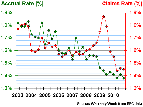
There was clearly a spike in the claims data in 2009, as new product sales hit bottom and the repair bills for products sold in 2007 and 2008 came due. Manufacturers were spending that year's diminished cash on the year before's product failures, and the claims rate went to a record 1.84% of sales in the spring of 2009.
For the last nine months of 2010, however, the claims rate was below 1.5% for the first time ever. And that, we suggest, is caused partly by a recovery in sales and partly by a jump in reliability.
How do we know? The accrual rate has been more or less declining in a straight line for eight years. That's the green line in Figure 4, and it has never been higher than it was in 2003 and never been lower than it was in 2010. This trend -- the tendency to build better products and spend less on repairs -- proceeded uninterrupted by the downturn of 2008-2009.
Manufacturing Success Story
And as if to confirm the foresight of the financial planners who stuck to their lower accrual forecasts even as claims soared, in 2010 the claims rate came down to almost meet the accrual rate. That's a success story that needs to be told, as the pundits continue to say that American companies don't make anything anymore, or that they don't make 'em like they used to.
Figures 5, 6 and 7 track the relative "market shares" of the 14 industry sectors in terms of claims, accruals, and warranty reserves. For instance, in Figure 5 we see the share of claims reported by the automotive OEMs to be 35%. In Figure 6, their share of accruals is only 31%. Yet their share of reserves in Figure 7 is 38%. Taken together, this means they have a legacy of high reserves, heightened claims, and an expectation of declining repair costs.
The computer OEMs, meanwhile, were responsible for 21% of the claims in 2010 and 24% of the accruals. But their share of warranty reserves was only 14%. This reflects the fact that computer warranties tend to be shorter than passenger car warranties. And the mismatch between claims and accruals suggests an expectation of higher sales and higher repair costs.
Figure 5
All U.S. Manufacturers
Claims Paid per Industry, 2010
(as a % of $24.1 billion total)
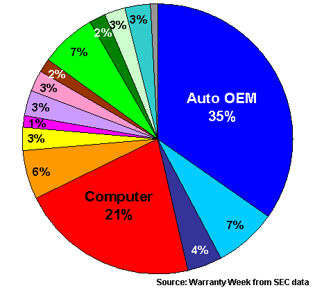
This is the same data reported in the right-most columns of Figures 1-3. The corresponding pie charts for 2009 can be found in the April 8, 2010 newsletter. We won't read too much into the annual changes, because we've already detailed which sectors changed more and less than the overall average.
Figure 6
All U.S. Manufacturers
Accruals Made per Industry, 2010
(as a % of $23.4 billion total)
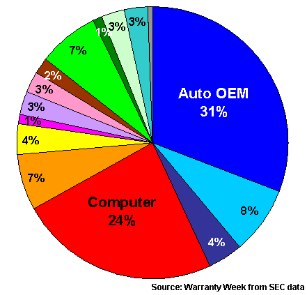
All of these charts are color coded so that the vehicle-related categories are in shades of blue; the high-tech sectors are in shades of red; and the building trades are in shades of green. We've tried to keep this consistent through the years, to allow for easier comparisons.
You'll notice that the high tech sectors account for roughly 40% of claims and accruals, but only 27% of reserves. The vehicle sectors account for around 45% of claims and accruals and around 55% of reserves. And the building trades account for around 15% of claims and accruals and 18% of reserves. Again, this is partly due to average warranty durations in these industries, and partly due to future expectations of repair costs.
Figure 7
All U.S. Manufacturers
Reserves Held per Industry, 2010
(as a % of $35 billion total)

For the last three charts, we just want to detail the annual totals for warranty claims. We also included the annual totals for each, so all our readers can check our math. If something can't be read, or if readers want figures not rounded off to the nearest million dollars, please contact the editor at earnum(at)warrantyweek.com.
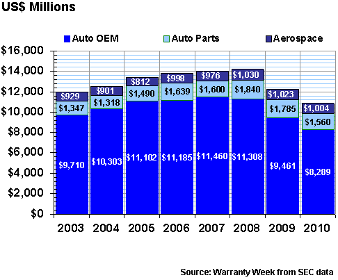
Figure 8 more or less confirms what the headlines would make us expect to see: that the automotive sector was badly damaged by the 2008-2009 downturn. The 2008 peak was $13.9 billion with aerospace included, and $12.9 billion for just the automotive sectors. But also notice how the auto OEMs saw the biggest decline, and how aerospace gained and declined relatively little over the past five years. We shall have more to say about this in a future newsletter.
Figure 8
Warranty Claims in Automotive & Aerospace
Claims Paid by U.S.-based Companies
(in US$ millions, 2003-2010)
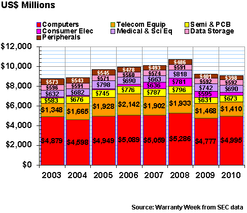
In Figure 9, we're including seven high tech sectors, the largest of which are the computer OEMs. Notice how their claims totals have remained relatively stable over the years, while there was a peak for telecom equipment in 2006 and for most of the other sectors in 2008. But also notice how consumer electronics was too small to get labeled in 2003-2006, and how it grew in 2007-2009, only to fall back to a sliver once again in 2010. This, as we've suggested, is more or less the legacy of the Microsoft Xbox 360.
Figure 9
Warranty Claims in the High-Tech Industries
Claims Paid by U.S.-based Companies
(in US$ millions, 2003-2010)
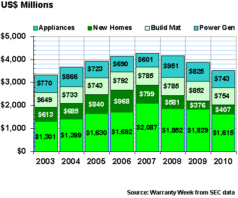
And finally, we wanted to spotlight claims trends in the building trades, and to ask a question. Appliance makers saw claims peak in 2007. Homebuilders saw a 2006 peak. The makers of fixtures, furniture, and building materials actually saw a 2009 peak. The makers of electrical power generators, batteries, windmills, and other power equipment saw a 2008 peak.
Renewable Energy Equipment?
Which leads us to our question: is it time to start breaking out the solar, wind, fuel cell, and rechargeable battery power equipment manufacturers into a separate sector? Or should they all be lumped together into one big "power" sector?
The reason we ask this question is because if there were such a sector as "solar," we might be able to move some companies out of the semiconductor sector and into it. If it were called "renewable energy equipment" or some other "green" label, we might even be able to move some of the electrical vehicle parts manufacturers into it. And given the very long warranties being issued in the sector, the data might display some unusual properties.
On the other hand, the leader in this sector is General Electric, which makes not only the traditional kinds of oil, coal and nuclear-fueled power turbines, but also the next generation of windmills and solar modules. So it could land on either side of the split. Therefore, maybe it's better to leave things as they are, to keep the figures comparable over time?
Figure 10
Warranty Claims in the Building Trades
Claims Paid by U.S.-based Companies
(in US$ millions, 2003-2010)
So what's the overall story here? On the one hand, the data presented here documents the recent downturn and the gradual recovery from it. But on the other hand, there's a statistical story in the data about the increased attention being paid to warranty costs, and the successful measures that manufacturers have taken to reduce those costs not only in absolute terms but also as a percentage of sales. Yes, product sales declined, but in some cases warranty costs declined even faster. And that's a success story that needs to be told.
Eighth Annual Product Warranty Reports
In future weeks, we'll tell this story in a bit more detail, using specific companies as examples. And, as usual, we stand ready to help our readers populate the charts in their own presentations, should there be a need for a specific data series.
Here are the links to the online editions of all eleven parts of this series:
- Top 100 Warranty Providers of 2010
- 2010 Warranty Totals & Averages
- Automotive Warranty Report
- Aerospace Warranty Report
- Computer Warranty Report
- Disk Drive & Semiconductor Report
- Telecom Equipment Warranty Report
- Medical & Scientific Equipment Warranty Report
- New Home Warranty Report
- Fixtures, Furniture & Building Material Warranty Report
- Appliance & HVAC System Warranty Report
Readers needing more detailed snapshots of individual companies in either a PowerPoint or Excel format are invited to view the list of charts and spreadsheets available on the Warranty Statistics page.
Warranty Week Joins Facebook
By the way, Warranty Week recently joined Facebook, and we've begun posting links to our weekly newsletters on the page called "Warranty Week." If any of our readers are Facebook users, we encourage you to "like" the page and to write on its wall. If nothing else, it's a good way to get around the spam filters and corporate firewalls that sometimes impede delivery of the email and web editions of this newsletter.