

Ninth Annual Warranty Report,
Totals & Averages:
Warranty expenses rose in 2011, as the recovery continued to take hold. But sales grew a bit faster, and the percentage of revenue used to pay for warranty work fell to record low levels.
The recovery gained momentum in 2011, as evidenced by data in the annual reports of hundreds of American manufacturers published in the last few weeks. But the really good news is that while sales bounced back, warranty costs grew only slightly, suggesting that manufacturers have improved product quality and increased the efficiency of their warranty processes.
Using three essential warranty metrics -- claims paid, accruals made, and reserves held -- we've assembled a set of ten charts that provide a glimpse of this trend over the past nine years. When manufacturers first began publishing their warranty cost metrics in 2003, most were paying out less money per year, but it was a larger share of their product sales revenue. And then in 2007 or 2008 those payouts peaked, but the percentages kept falling. And falling.
Last June, American manufacturers reported the smallest percentages of sales ever spent on warranty, suggesting that the attention they've given to their warranty process over the past decade has paid off.
Claims Payments
In Figure 1, we've categorized all warranty-reporting U.S.-based manufacturers into one and only one industry segment (based on their primary product line), and counted up the claims they reported paying during each calendar year since 2003. One can clearly see the upward trend until 2008, then the downward trend until 2010, followed by what looks to be the beginning of another upward trend last year.
Figure 1
Worldwide Warranty Claims
of U.S.-based Companies
(claims paid in US$ millions, 2003-2011)
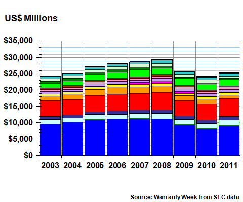
Claims payments were up 5.4% last year to $25.4 billion. And since product sales were up nearly 13%, the percentage of sales spent on warranty claims fell to a new year-end low of 1.35%. At the end of 2010, claims payments had totaled $24.1 billion and the claims rate stood at 1.52%.
Of the 14 industry segments identified in Figure 1, nine saw increases in claims payments while five saw decreases. Power generation equipment saw the largest increase in payments relative to what they paid in 2010, while consumer electronics saw the largest relative decrease. In sheer dollar terms, the automotive OEMs saw the biggest jump in payments, while the telecom equipment makers saw the biggest annual decline.
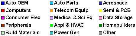
Claims payments, given that they always lag behind product sales by months if not years, are usually a bit behind the other statistics. Warranty accruals, on the other hand, are usually a bit ahead. One can see in Figure 2, for instance, that accruals peaked in 2007 while claims peaked a year later in 2008. The bottom for accruals was in 2009, while claims payments hit bottom in 2010.
Accruals Linked to Sales
Accruals are made at the time of sale, so depending upon the length of a warranty and the typical age of a product at the time of repair, there could easily be a year's lag time between the metrics. In other words, accruals made in 2007 were used to pay claims in 2008.
Accruals were up 8.5% in 2011 to $25.4 billion. Again, this was below the rate of increase in product sales. So once again, the accrual rate as a percentage of sales actually fell, even though the amount of accruals in dollars rose.
In Figure 2, one can see the massive drop in accruals made in 2009. But one can also see the two annual increases since then. Interestingly, in 2011 both the accrual and claims totals went back above 2003 levels.
Figure 2
Worldwide Warranty Accruals
of U.S.-based Companies
(accruals made in US$ millions, 2003-2011)
Of the 14 industry segments identified in Figure 2, nine saw accruals grow in 2011 while five saw them decrease. Power equipment and automotive OEMs once again led the increases, and consumer electronics and semiconductors & printed circuit boards again led the declines.
Semiconductor & printed circuit board manufacturers saw claims increase and accruals decrease. The makers of building materials saw accruals rise and claims fall. The other 12 segments saw claims and accruals either increase or decrease together. We're not sure what this means, but it does seem curious.
Warranty Reserves
Theoretically, the increase in accruals, minus the increase in claims, should equal the change in the balance of the warranty reserve funds. But there are other contributors to consider: fluctuations in foreign currencies, changes in estimate, acquisitions, and in the case of at least Ford Motor Co., the inclusion of reserves once counted separately for product recalls. So the formula doesn't always work out exactly.
In 2011, accruals rose by $2.0 billion while claims rose by $1.3 billion. Yet reserves rose by almost $2.65 billion, to a balance of $35.8 billion by the end of December 2011. Obviously, there are a significant number of mergers and acquisitions in the mix, along with gains in the value of the dollar and other factors.
In Figure 3, the peak year for warranty reserves was clearly 2007, while the trough seems to stretch across both 2009 and 2010. For the record, there was a $96 million increase in reserves from 2009 to 2010. But then there was a $2.95 billion increase in warranty reserves from 2010 to 2011.
Figure 3
Worldwide Warranty Reserves
of U.S.-based Companies
(year-end balance in US$ millions, 2003-2011)
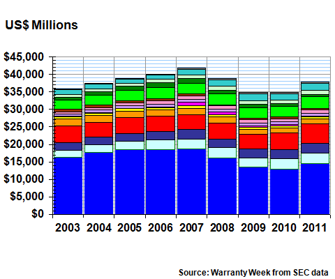
Of the 14 industry sectors identified in Figure 3, eight saw increases while six saw decreases in their year-end warranty reserve balances in 2011. Once again, the automotive OEMs saw strong gains. But so did the computer OEMs. And even the appliance OEMs saw large increases in their reserve balances. We'd attribute all of these to improving sales.
In contrast, the sectors that saw the largest balance decreases, both in terms of dollars and the relative change, were the builders of new homes. As we've noted year after year, this sector still seems to be in search of a bottom. But there were also noticeable drops in the reserve balances of the computer peripheral makers as well as the makers of semiconductors and printed circuit boards.
Compared to Sales
Unseen in any of these charts but certainly felt in their effect are the metrics for product sales. In Figures 1 through 3 we're cheering for dollar increases in warranty expenses, and marking how the peaks and valleys match or lag behind the economic cycle. Now, let's make some direct comparisons to sales.
If warranty costs rise, but sales rise faster, then the percentage of sales spent on warranty will fall. In other words, we can feel comfortable cheering rising expenses if revenues are rising faster. Conversely, during the recession years, sales fell but warranty expenses fell faster. So even during those tough times, there was some good news to report, in terms of falling expense rates.
In Figure 4, we're happy to report that the good news continues. The red line is a comparisons of claims and sales since 2003. The green line is a comparison of accruals and sales since 2003. Except for that very noticeable recessionary bulge in 2008-09, and some smaller bumps along the way, both lines have been trending downwards for most of the past nine years.
This is a chart that manufacturers can be proud of. It shows that relative warranty costs are declining, partly because products are more reliable, and partly because the warranty process itself is becoming more efficient.
The only cause for worry is the way the chart hits bottom in the second quarter of 2011, with an accrual rate of 1.27% and a claims rate of 1.34%. Does that make the most recent two quarters the beginning of an upwards trend? Or is this just another minor bump in a multi-year downward trend that will resume shortly? Only time will tell.
Figure 4
All U.S.-based Companies
Average Warranty Claims & Accrual Rates
(as a % of product sales, 2003-2011)
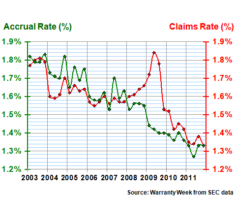
Interestingly, the claims and accrual rates were also very close to each other during 2011. They clearly diverged in 2008-10, which we'd blame on not only the recession but also the lag time between claims and accruals. Back in 2003-2007, the two rates were usually close together. So perhaps what we saw in 2011 was things getting back to normal?
Warranty "Market Share"
Next we'd like to present a set of three pie charts that assign a "market share" to each of the 14 industry sectors. Figure 5 is for claims, so it's a different way of expressing the 2011 data in Figure 1. Figure 6 is for accruals, so it maps to the 2011 column in Figure 2. And Figure 7 is for warranty reserves, so it's the same data as in Figure 3 in the 2011 column.
Figure 5
All U.S. Manufacturers
Claims Paid per Industry, 2011
(as a % of $25.4 billion total)
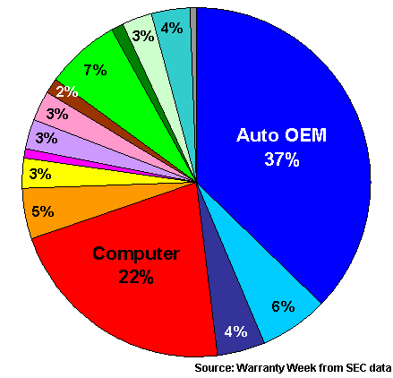
Note that in all three pie charts, the OEMs dominate. Whether it's the automotive business, the computer business, or the appliance business, it's always the OEMs who suffer the most warranty expense. Their respective suppliers always pay less, both in dollars and as a percentage of their product sales revenue.
What you don't see are the comparisons with years past. For that, you'll have to call up copies of the April 1, 2011 and April 8, 2010 newsletters, which follow the same format as this year's annual report.
Speaking of annual reports, more are being filed each day with the U.S. Securities and Exchange Commission. Between now and the end of the month, we're expecting 31 more manufacturers to file, with the largest among them building materials makers Nortek Inc. and Associated Materials LLC.
We'd expect them to have some impact upon the averages and totals, but not enough to force us to wait until April before publishing this report. For some reason, most of the largest warranty providers were several weeks early this year with their SEC filings. So we were able to get this annual compilation together a few weeks sooner than usual.
Rising Reliability and Sales
Though the amount of claims paid and accruals made in 2011 were approximately the same, the "market shares" were different in each industry. Claims were way ahead of accruals among the automotive OEMs, while the reverse was true among the computer OEMs. We'd suggest the former as an example of rising reliability and the second as an example of rising sales.Figure 6
All U.S. Manufacturers
Accruals Made per Industry, 2011
(as a % of $25.4 billion total)
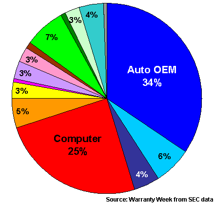
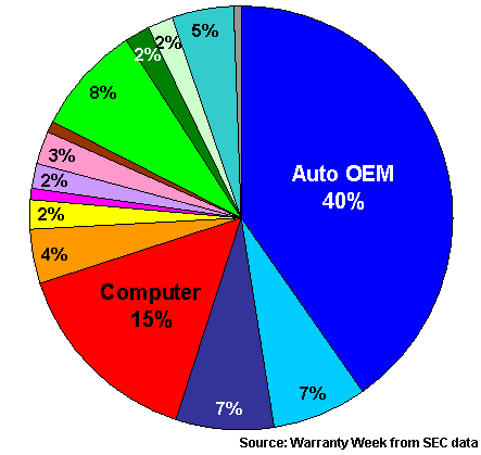
Note that while the "market shares" in Figures 5 and 6 are relatively close together, they differ considerably from the percentages in Figure 7. This is because some industry sectors such as automotive are known for their relatively longer warranties, which force manufacturers to accrue for multiple years.
Across all industries, the multiple between claims and reserves now stands at 16 months, which means that half the warranties are longer and half the warranties are shorter than that. And in the sectors where they tend to be longer, their "market share" in Figure 7 will be larger.
In general, the vehicle sectors account for a little less than half the claims and accruals, and about 55% to 60% of the reserves. The high-tech electronics sectors account for a little less than 40% of the claims and accruals and slightly more than a quarter of the reserves. The building sectors account for the remaining 15% or so for all three metrics.
Figure 7
All U.S. Manufacturers
Reserves Held per Industry, 2011
(as a % of $37.9 billion total)
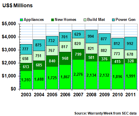
Now, let's take the data in Figure 1 and chop it up in yet another way. In Figure 8, we've charted the three vehicle sectors. In Figure 9, we've charted the seven high-tech electronics sectors. And in Figure 10, we've charted the four building-related sectors.
In each case, we've charted just their annual claims payments. In future weeks, we'll take a closer look at their accruals and reserves as well.
Swift Recovery in Auto?
By grouping similar industries together, we can see a clear difference between them in terms of both the depth of the recession and the velocity of the recovery. In Figure 8, the claims data for vehicle warranties shows both a clear peak and a clear trough. And the totals were clearly up in 2011, suggesting a robust recovery is under way. But in Figures 9 and 10, there are very small increases in 2011. And none of the three groups was yet back to 2008 levels in 2011. Still, only the vehicle group shows a clear recovery after a clear bottom in the totals.
Figure 8
Warranty Claims in Automotive & Aerospace
Claims Paid by U.S.-based Companies
(in US$ millions, 2003-2011)
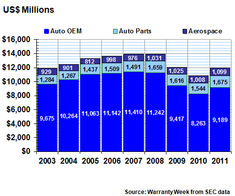
Within these groupings, all three industry sectors in the vehicle group saw claims increase last year. In the high-tech sectors of Figure 9, only the computer OEMs, the data storage, the medical and scientific equipment, and the semiconductor & printed circuit board manufacturers saw an increase. In the building-related sectors of Figure 10, only the appliance & HVAC, and the power generation equipment manufacturers saw increases.
Figure 9
Warranty Claims in the High-Tech Industries
Claims Paid by U.S.-based Companies
(in US$ millions, 2003-2011)
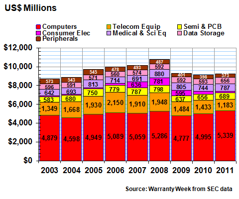
In Figure 9, because of space constraints we've dropped the label from the consumer electronics sector for the past two years. This, in its own way, is very good news. As we detailed in a January 26, 2012 newsletter, besides the Microsoft Xbox 360, most of the CE business in the U.S. is dominated by importers not counted in this chart. So now that the Xbox 360's claims payments are receding, so is the entire sector.
We should also note that because Apple Inc. is still being counted as a computer manufacturer, all of its claims payments for iPhones helped drive up that sector to a new height in 2011. Data storage and aerospace are the only other sectors to set a new record last year.
In Figure 10, there's only a $93 million increase for the four-sector total from 2010 to 2011. Had it not been for General Electric's increase in claims (counted within the power generation equipment sector) the overall trend would have been down.
Last year, an increase in homebuilder claims payments looked promising. But it slipped in 2011 to a new low of $328 million. In contrast, appliance OEMs, while showing only slight growth in 2011 claims payments, never really fell that fast or that far during the recession. And power generation equipment, thanks to sales of turbines, windmills and solar panels, seem to be on their own economic cycle.
Figure 10
Warranty Claims in the Building Trades
Claims Paid by U.S.-based Companies
(in US$ millions, 2003-2011)
And that seems to be the takeaway from these charts: Some of the industry sectors that were hard-hit by the recession, such as automotive, are now firmly in recovery mode. Others such as new home building, are still contracting.
Also, warranty spending patterns by some of the largest warranty providers, such as Apple, GE and Microsoft, can swing the totals and averages in their respective industry sectors quite significantly.
Ninth Annual Product Warranty Reports
As we continue with our annual survey of U.S.-based warranty providers, here are the links to the online editions of all the other parts of this series:
- Ninth Annual Warranty Report, Totals & Averages
- Top 100 Warranty Providers of 2011
- Aerospace Warranties
- Automotive Warranty Report
- Computer & Disk Drive Warranties
- Telecom Equipment Warranties
- Medical & Scientific Equipment Warranties
- Semiconductor Warranties
- New Home Warranties
- Appliance & HVAC System Warranties
- Fixtures, Furniture & Building Material Warranties
Readers needing more detailed snapshots of individual companies in either a PowerPoint or Excel format are invited to view the list of charts and spreadsheets available on the Warranty Statistics page.